To perfectly symphonize quality journalism with multimillion readership it is crucial to have up to date information of all complex systems in one place.
Imagine there are some technical issues during the Election night. Engineers on-call would need an immediate way to know why and what caused the issue to fix it, so that it wouldn’t impact your experience with the graphics. They would need to quickly retrieve all essential information to solve the problem: from understanding what dependent application might have caused the bug to knowing what team to communicate to.
As a sole designer on the team I spent a year crafting Application Catalog, a centralized tool of truth of all applications, software, and services at the New York Times. Here are some design decisions and learnings.
Invisible design and fluid workflows
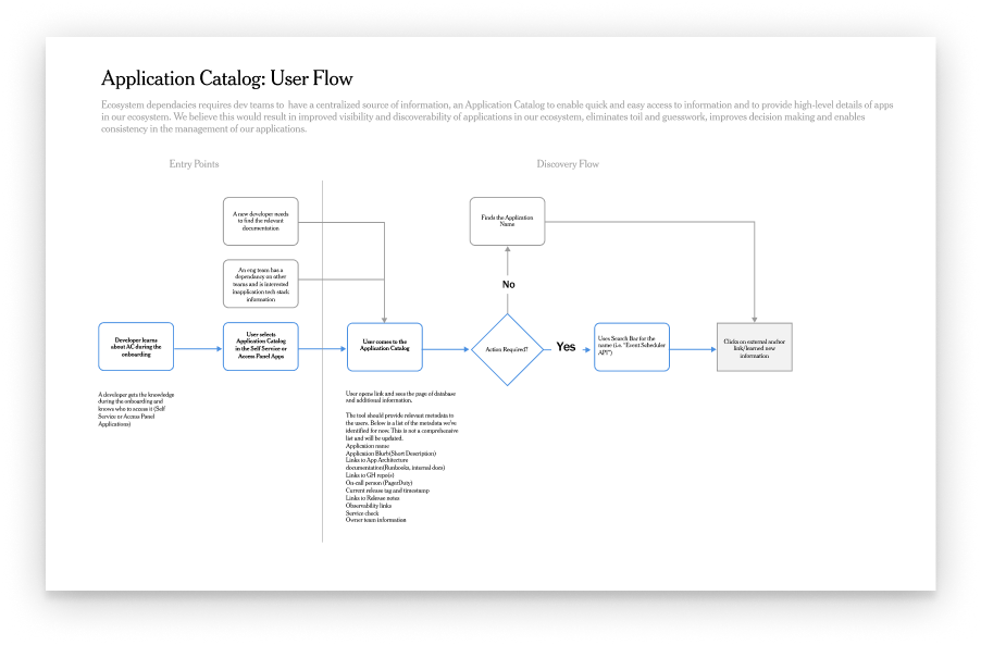
It all starts from thorough research to understand the nature of the need. Diving into the conversations with engineers and managers from more than 10 teams I discovered that the tool would serve in many different fluid workflows: a new hire onboarding, risk estimation of system dependencies when building a new feature, debugging, API and documentation searches, or troubleshooting urgent technical issues.
But what if those different flows would enable different types of interaction with the product? How could we serve all use cases? Much of the tool-mediation is about the materiality of interaction, a relationship between artifacts and how people use them. I learned that the tool has to be there at the right time of one’s workflow, to be on top of mind so that it will be the first place they would go to find truth efficiently and won’t even notice they are using it. It is in a way crafting an invisible design artifact.
Information as a material
Truth to materials is an architectural concept that materials should be used where they are most appropriate, and without their innate qualities being concealed in any way. When designing software, this concept metaphorically applies when the material you work with is information. It was important to determine which pieces of information to surface on a higher level of abstraction, prioritize for architectural flexibility of interaction vs. for the most common use case.
We knew the product would entail more than 200 applications, each of them consisting of much more granular pieces of information. I categorized them by a gradual contextual proximity with the artifact : from a high level of information such as contact info / team ownership to a more in-depth technicality of an application. This helped to structure information architecture for software.
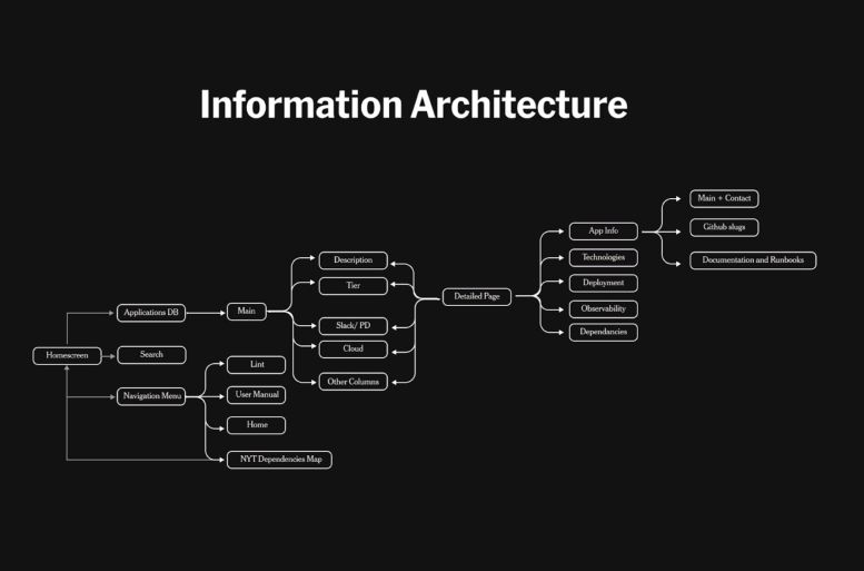
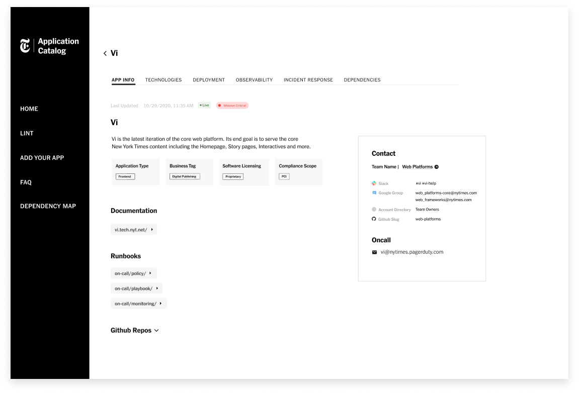
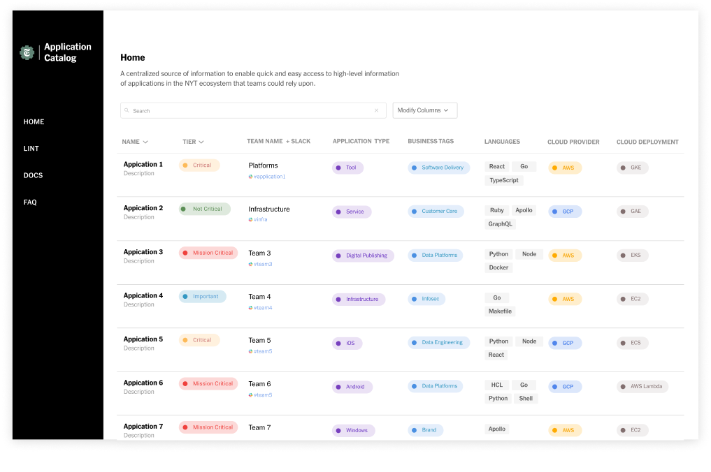
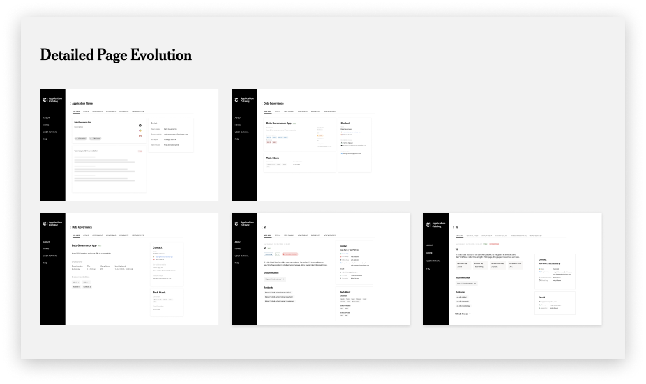
Application Catalog consists of three main sections: a navigation menu on the left side, search and data table of all applications, and a detailed page for each of the app. Each of the sections required further deconstruction of information hierarchy: typography, iconography, and tabs configurations.
Understanding certain pattern components was key. Each application, for example, would have its technologies, dependency mapping, deployment, observability, or incident response. This helped me to validate the choice of tab configurations for a closer relationship with the artifact.
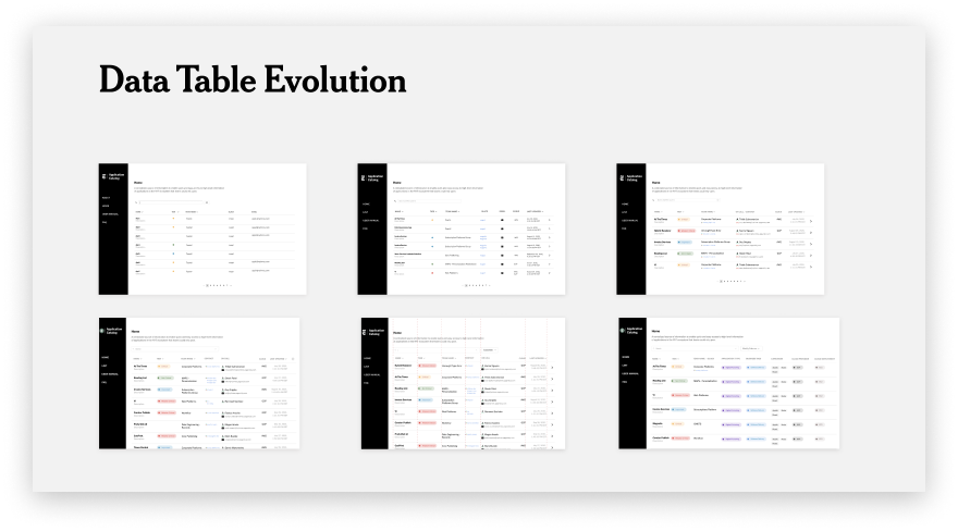
Datatable is a form that follows a function
Tabular representation was the right choice because of its flexibility in enabling affordances like customization for a more efficient retrieval of information surfacing. Because the function of the Application Catalog was to contextually serve in various fluid workflows, there was a need for a customized interactive representation of information. Datatable was the most intuitive form to follow that function as it enabled for a feature like “Modify columns.”
Engineers, who need to know what are the most common languages for web apps, would be able to select “Languages” column in “Modify Columns” button and specify other details to customize their datatable. There was also a lot of conversation around UX writing, how should we communicate clearly the feature’s function — editing columns is different from modifying their configuration in the table in a way that users would need to edit the data inputs. In the process of feature building I worked very closely with engineers to do quality assurance with designs, review pull requests and sometimes code the components.
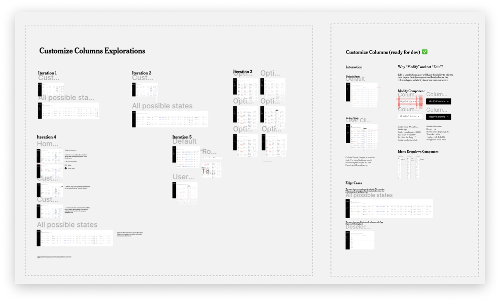
I also iterated multiple times to test what kind of information I could communicate through symbols or color systems. Tiers, for example, are color coded from “Mission Critical” to “Non Critical.” Thinking more about reusable components, there were times when we would integrate both Ink (the New York Times design system) as well as creating new pattern components for the tool to serve its unique purposes.
Complexity simplification to drive a greater adoption
One of the main success metrics in designing the catalog was a cross-organizational adoption of the tool. Making sure there are playful yet simple details to encourage teams to contribute to the product was a part of end-to-end UX. Application Catalog would be meaningless without each of the team’s documentation of all the apps and services they own. Today more than 200 applications live in the product, from Cooking, Games to Publishing Tools and Newsroom teams. I have designed and built interactive artifacts as well as deprioritized some features.
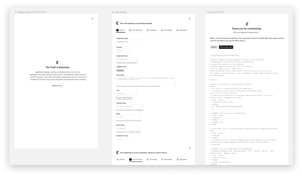
UI Form.
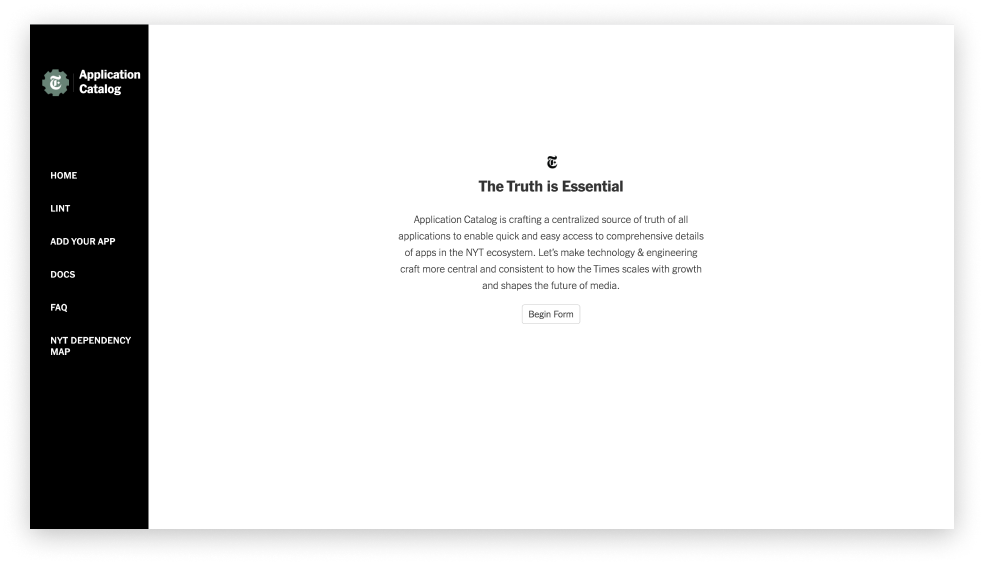
Previously teams had to input their data about the application by filling out the Yaml file on Github. The objective was to create a user friendly and delightful form instead of filling a daunting form to surface all applications in the ecosystem. The design challenge was to inspire users to successfully complete the form, decreasing the perception of complexity and cognitive load of information. I chose to focus on ‘Truth is Essential”
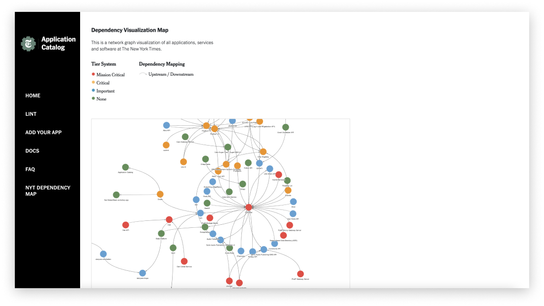
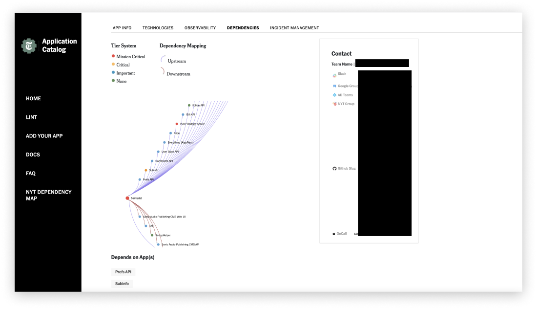
Dependency Visualization Map.
Visualizing data is a powerful way to represent information even when it comes to internal tools. The network diagram was the perfect way to display the relationships between applications. It is a directed graph, where each node’s color indicates application’s tie and edge’s color — upstream/downstream dependency.
Reflections
As designers for different flows and of tools, it is oftentimes imagining future preferred situations. What I learned about crafting this tool is a compositional approach to inform how things might come together as a whole (systems thinking) as well as an understanding of materiality of interaction in design. Combination and unification of various materials (or components) might unlock great opportunities for interaction, but useful interactions would require much so of balancing user actions within the product, enabled by interactive artifacts. Design affordances might communicate the meaning of functionality, but so is the meaning oftentimes relational, depending on one’s context or workflow.
Speaking about design process as a sole designer, it is crucial to constantly surface design perspective to the teams’ decisions even if you are an intern, iterate product features based on user research and usability insights, adhere to quality design standards, and afford playful interactions for a larger adoption across all teams at the New York Times.